
 您的位置:
您的位置:4、一点CSS3点缀:
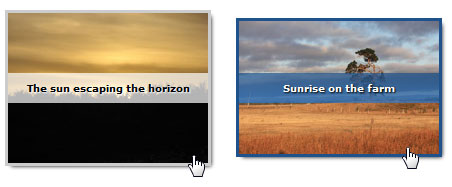
当然,一些CSS3属性能让它更好一点。此时,我们只是用渐进增强的原则,其中CSS3-capable的浏览器将略为更好的体验。 在我们spruced CSS3后,我们的特效仍然CSS2-capable浏览器的工作,如Internet Explorer 7。
当在图像上使用hoverfocused时,在(.outline)属性框添加阴影属性以便显示一个不错的css3投影效果。
注意:目前box-shadow这个属性还不能通过CSS验证。
ul a:hover, ul a:focus
{
display: block;
outline: none;
-moz-box-shadow: 3px 3px 5px #000;
-webkit-box-shadow: 3px 3px 5px #000;
box-shadow: 3px 3px 5px #000;
}
使用CSS3(rgba())属性时,我们可以略使背景透明,以便我们标题可以看到图像。 设置全彩从我们的rgba值确保浏览器,如IE8还显示背景前。
ul a:hover:after,
ul a:focus:after
{
background: rgb(255,255,255);
background: rgba(255,255,255,0.7);
}
Firefox 3.6, Safari 4 and Chrome 4的兼容性问题
background: -moz-linear-gradient(top, rgba(255,255,255,0.7), rgba(204,204,204,0.7)); /* Firefox 3.6+ */
background: -webkit-gradient(linear, 0% 0%, 0% 100%, from(rgba(255,255,255,0.7)), to(rgba(204,204,204,0.7))); /* Safari/Chrome */
为了使标题文本更突出一点,我已经一个(text-shadow)来实现阴影文本。
text-shadow: 1px 1px 1px #fff;
用(.box-sizing)这个属性来调整框模型的工作方式。
ul a.alternate01:hover:after,
ul a.alternate01:focus:after
{
top: 0;
width: 50%;
height: 100%;
line-height: normal;
text-align: left;
padding: 4px;
font-size: 12px;
-moz-box-sizing: border-box;
-webkit-box-sizing: border-box;
box-sizing: border-box;
}
通过调整框模型,利用这项技术可以进一步扩展标题框的大小调整我们的优势,所以我们尽可能灵活可以把这个技术使图像叠加覆盖半个,内容运行了一边。
ul a.reverse:hover:after,
ul a.reverse:focus:after { top: 0; right: 0;
解决IE显示的问题
ul li img { position: relative; z-index: -1; } /* For IE8 */
ul li:not(#foo) img { position: static; } /* Reset position for better browsers *
5、总结
把上面的事情综合一下。我们就得到了我们想要的代码和显示效果
html代码:
<!DOCTYPE html PUBLIC "-//W3C//DTD XHTML 1.0 Strict//EN" "http://www.w3.org/TR/xhtml1/DTD/xhtml1-strict.dtd">
<html xmlns="http://www.w3.org/1999/xhtml">
<head>
<meta http-equiv="Content-Type" content="text/html; charset=utf-8" />
<link rel="stylesheet" type="text/css" href="_styles.css" media="screen" />
<title>Snazzy hover effects using CSS demo</title>
</head>
<body>
<ul>
<li>
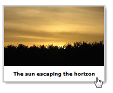
<a href="#" title="Sunrise on the farm">
<img src="img_sunrise.jpg" width="300" height="200" alt="Beautiful sunrise" />
</a>
</li>
</ul>
</body>
</html>
CSS代码:
ul { overflow: hidden; padding: 5px; }
ul > li {
position: relative;
float: left;
list-style: none;
margin: 0 20px 20px 0;
font-size: 10px;
}
ul a { text-decoration: none; display: block; }
ul li img { display: block; position: relative; z-index: -1; } /* IE8 fix, background colour appears behind img for uknown reason set negative z-index */
ul li:not([class=na]) img { position: static; } /* Reset relative position, as this plays havoc with good browsers */
ul a:hover, ul a:focus
{
display: block;
outline: none;
-moz-box-shadow: 3px 3px 5px #000;
-webkit-box-shadow: 3px 3px 5px #000;
box-shadow: 3px 3px 5px #000;
}
ul a:hover img, ul a:focus img { outline: 3px solid #ccc; }ul a:hover:after,
ul a:focus:after
{
content: attr(title);
color: #000;
position: absolute;
bottom: 0;
height: 30px;
line-height: 30px;
text-align: center;
font-weight: bold;
width: 100%;
background: rgb(255,255,255);
background: rgba(255,255,255,0.7);
background: -moz-linear-gradient(top, rgba(255,255,255,0.7), rgba(204,204,204,0.7)); /* Firefox 3.6+ */
background: -webkit-gradient(linear, 0% 0%, 0% 100%, from(rgba(255,255,255,0.7)), to(rgba(204,204,204,0.7))); /* Safari */
display: block;
text-shadow: 1px 1px 1px #fff;
}


 |
|
 vip@34178.net 专注于网站建设和搭建网络营销体系-与您一起互联网上发现商机!

